Each year – for the past 25 years – Pantone has announced a colour which it claims is the new trending colour for the year ahead. For 2026, that colour is PANTONE 11-4201 Cloud Dancer – a much more evocative name than its palette.
Pantone describes its choice as, ‘a lofty white that serves as a symbol of calming influence in a society rediscovering the value of quiet reflection. A billowy white imbued with serenity, PANTONE 11-4201 Cloud Dancer encourages true relaxation and focus, allowing the mind to wander and creativity to breathe, making room for innovation.’
In reality, the colour is about as bland as you can get – a kind of grey white: a bit like a miserable day, with no life in the sky.
Pantone: quick links
Pantone: greywashing design
‘The colors around us aren’t just changing. They’re disappearing,’ website The Culturist wrote earlier this year.
‘According to major auto paint suppliers, more than 80% of new cars are now grayscale. Black, white, gray, and silver dominate the roads. Reds, blues, and greens in auto production are increasingly rare.’
Much has been written in recent years about the ‘greying’ of contemporary society. It is as though any expression through colour has become so feared, so frowned upon, that contemporary life is increasingly being reduced to monotone: a parade of endless dreary aspects of the grey scale.
In our dulling world, Pantone’s announcement can thus be seen as the latest marker on the greying trail.
Are Pantone criticisms warranted as corporations colour our lives?
This week’s (3 December) Pantone reveal has been received with a wave of criticism on social media. Further, the process has increased criticism about a decision by a small committee making closed-door predictions, which then triggers global trends for retailers, designers and brands. Should corporations get to choose how we colour our lives?
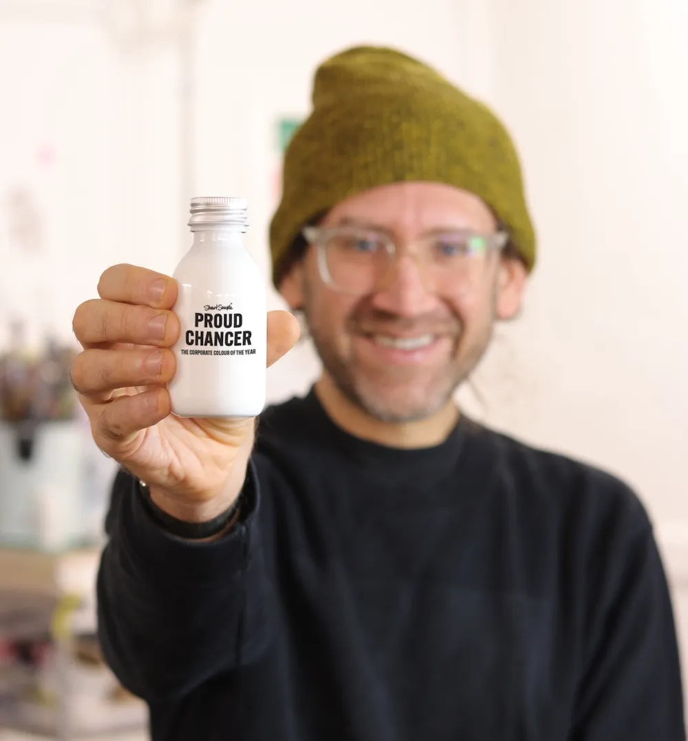
The British artist and self-labelled ‘colour activist’, Stuart Semple has taken things a step further. Known for his spat over Anish Kapoor’s licensing of the world’s blackest black (2017), Semple released his own alternative: the world’s pinkest pink, which he banned Kapoor from owning. Today, Semple has again entered the fray as a kind of advocate for colour liberation.
Read: Artist bans Anish Kapoor from world’s hottest pink (2016)
In a formal statement, he told ArtsHub: ‘Colour should belong to everyone and to dictate our palette is all shades of shady.’
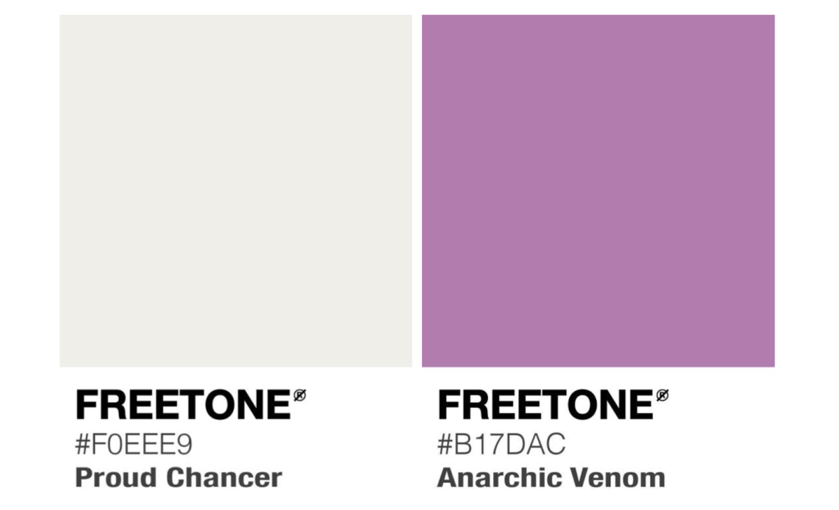
Immediately on hearing about Pantone’s 2026 colour, Semple released his own pigment titled Proud Chancer, describing it on Instagram as ‘a dupe of the corporately controlled shade’. Semple works to make colour available to anyone who wants it – as long as they can confirm they are not associated with Pantone.
Pantone: the people vote on their own colour
Semple has also revealed the ‘official’ People’s Colour of the Year, Anarchic Venom – chosen at lightening speed by public vote.
Riffing off Pantone’s marketing vernacular, Semple describes the 2026 ‘true’ colour:
‘Anarchic Venom is a softly subversive violet, blending the calm of crushed lavender with a quiet electric pulse beneath the surface. It feels velvety and reflective, a colour that invites calm while hinting at creative rebellion.
‘Both comforting and provocative, it carries the mood of gentle nostalgia mixed with forward-moving unrest. Subtle but insistent, Anarchic Venom is elegance tipped with revolution, a reminder that softness can be powerful, and change can begin in the quietest shade.’