Art Gallery of NSW; Photo Artshub
Viewing exhibitions has become a hyper-sensory and layered experience. Audiences will often seek out the interactive moment, and are happy to be led on a journey through an exhibition’s narrative.
How, then, does that translate to the use of colour in a gallery space?
The consensus is that colour constructs mood for an exhibition, one that is in sync with the artworks on show. The trick is getting that tone right – both chromatically and emotionally. Too much and it overwhelms, and too little, then why bother? You’re just wasting money.
While the white cube largely prevails, especially in a contemporary arena, it can also be too clinical for some exhibitions.
We spoke with curators and gallery professional from the majors to the independents, from university and regional galleries, to ascertain what the Australian trends and what have been their wins with colour.
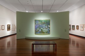
Art Gallery of NSW; photo ArtsHub
To paint or not to paint?
Megan Monte, Director of the independent Sydney gallery Cement Fondu, is a big fan of painting.
‘As a platform for social commentary, there’s no fixed approach to painting. It’s challenging to categorise contemporary styles and impulses as they are continually shifting and carving out unlikely spaces off the canvas. This is why I find painting exciting,’ she said.
For Erica Green, Curator and Director Samstag Museum of Art (SA) it is much simpler than that: ‘For me the starting point for an exhibition is either a neutral black or white ‘box’! – “lights out” or “peplum white”.’
She continued: ‘Occasionally Samstag’s walls are painted another colour but this is following discussion with the artist and would be an integral part of their work, rather than painting the walls of the gallery for “effect”.’
Samstag has just reverted to white walls, after its recent presentation of Lisa Reihana’s In Pursuit of Venus, a moving image presented on deep pacific blue walls.
For some spaces, the floor surface – be it warm timber, polished cool concrete, or 70s practical carpet – also weights and shapes the viewing experience. Colour can help draw the eye up, away from floor and enliven a space.
Similarly, if a space is too large, one needs to consider the intensity of the space when painted, just for its sheer volume.
It is a point that Annika Kristensen, Senior Curator at Australian Centre for Contemporary Art (ACCA) makes. She believes that ‘colour can be tricky – especially when you are painting spaces as large as the ACCA galleries. There have been a few moments when I’ve held my breath as the first rolls of paint are applied to our enveloping walls.’
While colour clearly comes secondary to the artwork for any astute curator, Jessica Bridgfoot, Director Bendigo Art Gallery says that we should remember that painting is not just trend driven, or a new fad.
She told ArtsHub: ‘Painting an interior of a museum or display space hails back centuries and really fell out of favour in the late 20th century with the advent of the ‘white cube’. I think there has been a noticeable return to the use of colour and exhibition design as a means to set a tone in which to experience the artwork or exhibition.’
Part of the 2011 transformation of the impressionist galleries at Paris’ iconic Musée d’Orsay was to abolish white walls, the Museum claiming that, ‘White is a terrible backdrop for any pre-20th-century art.’
The Gallery is now painted in a variety of colours including a special grey whose tone changes in different lights. Similarly, the National Gallery in London has no white walls today, also redecorated with deep, dark colours that allow its great Masters to hold the stage.
Brook Andrew installation view 2019 Adelaide International; Samstage Museum of Art; image supplied.
How colour can shape the viewer experience
Reading an article on exhibition colour, I was struck by the words of Larissa Harris, Curator, Queens Museum in America. ‘When I did a show of Michael Smith’s work in Antwerp we picked colors [sic] from the disco pants he was wearing in one of his videos,’ admitted Harris.
In Australia, the artist Brook Andrew has garnered a reputation for drawing in with gallery walls used as an extension of the artwork itself as Wiradjuri dendroglyphs.
Pointing to bold successes, Emma Collerton, Curator Bathurst Regional Art Gallery (BRAG), noted the National Gallery of Victoria’s recent use of silver walls, when it restaged The Field.
‘The silver walls in the 1968 The Field exhibition at NGV would have made the bright hard-edge abstract works pop! However, too much colour or if the shade is not right, can detract, compete [or] overwhelm artwork on display.

Installation view of the National Gallery of Victoria’s ‘The Field Revisited’ (2018) at NGV Australia at Federation Square; Photo Tom Ross
‘Feature walls are a good segue into an exhibition (to highlight something), where colour can be used like a full-stop or exclamation mark, to help visitors visually navigate a space,’ she continued.
Colour is often used to compartmentalise the journey through an exhibition – a way to move through its various themes or historical moments – a kind of Red Riding Hood trail of crumbs.
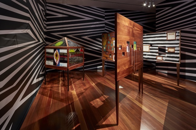
Yhonnie Scare’s ‘Strontium 90’ (2016) as part of the Sovereignty exhibition. Photo by Andrew Curtis.
Kristensen continued: ‘Over my time at ACCA I have seen some bold colours adorn our gallery walls – from the dramatic block colours framing Ulla von Brandenburg’s projections, to the eerie blue backdrop of Claire Lambe: Mother Holding Something Horrific, and the strong red that signalled the matriarchal strength of a room within the exhibition Sovereignty.
‘Each colour has changed the experience of the architecture in profound and sometimes unexpected ways.’
She added: ‘As an exhibition-maker, half the joy is in creating different experiences for our visitors by challenging and confounding their experience of a gallery space that they are very often familiar with … paint colour can be an effective way of presenting work in – quite literally – a different light.’
Monte is of the view that all forms reinvent themselves today, even paint.
‘Our appetite for new experiences expands with it. I’m intrigued to see painting evolve with this change so as not to dominate our experience, but to challenge it,’ building on Kristensen’s thesis.
Curators pick their colours
When Pantone announced its colour of the year in January would be Living Coral (PANTONE 16-1546) for 2019, the design sector geared up to see a barrage of new products in the shade – but has it made it to the walls of our art museums this year?
Pantone described it as ‘an animating and life-affirming coral hue with a golden undertone that energises and enlivens with a softer edge’, picking up on a global zeitgeist to be more aware of our environment’s fragility.
When posed with the question what colour do they have a burning desire to use for an exhibition’s wall, our curators answered:
Pink: While not quite Living Coral, Bridgfoot said that she has always wanted to paint a gallery pink, and now she is.
Bendigo Art Gallery’s forthcoming exhibition, Balenciaga Shaping Fashion, will be offset by lashes of screaming pink paint. ‘We will be using two colours – a fiery red to set the tone for Balenciaga’s Spanish heritage and a hot pink to indicate when the exhibition shifts to contemporary – showcasing the innovation and energy of designers in his wake.’
‘It’s such a high-key energetic colour and I think it’s important to take pink and blue out of that gendered space and bring it back to being – just a colour!’, Bridgfoot told ArtsHub.
Kristensen is also embracing pink. ‘As for a dream colour, I think TV Moore got to this first, when he painted a section of the gallery in Dulux ‘Pink Gin’ for his exhibition With Love and Squalor in 2015.’
Purple: For Collerton it was purple that she most wanted to play with in the gallery environment.
‘Purple is dynamic, bold, accessible and full of symbolism with associations including royalty/ grandeur, innovation (the first synthetic colour was mauve), feminism, wisdom, creativity, independence and magic. I am waiting for the right moment though.
Blue: While Monte wasn’t hankering to paint her gallery a specific colour, she said that she would be keen to ‘transform an entire gallery in Chroma Key Blue … It’s nothing new, artists have and continue to use Chroma Key within their practices, but it would be wild!’
Monte was not alone. Michelle Kuo, The Marlene Hess Curator of Painting and Sculpture at New York’s Museum of Modern Art (known for its pristine white walls) also went this route. ‘I just used Chroma Key Blue to go with Sondra Perry’s works, and am loving it!’
Monte continued: ‘It would be an immersive and playful environment to explore digital possibilities and performative actions. In unifying modes of practice, an opportunity emerges for artists to occupy the space in new ways.’

Tarnanthi, Art Gallery of South Australia; Photo Artshub
Greys & Neutrals: Collerton told ArtsHub she recently chose grey for BRAG’s current exhibition, Peter Solness: Lamplight – an artist who self-identifies as a light painter. ‘The walls of the exhibition space have been painted a dark grey which enhance the reading of Solness’ work. If the walls were white, it would not have the same dramatic effect.’
She continued: ‘Neutral colours such as shades of white (ivory, silver, chalk, beige), cream and greys tend not to compete with the artworks on display. The use of colour, the amount and shade depend upon the exhibition – [both its] curatorial rationale and artworks.’
Larissa Harris, Curator, Queens Museum in America, reminded that while it can be fun to be a fan of colour when designing an exhibition, ‘wall paint is expensive and you have to plan in advance.’
Her staple is a dove grey because it is also more sustainable, flexible and durable for a space.
The last word however rests with Bridgfoot. ‘When it’s done well the viewer perhaps does not notice it – it seeks to support the exhibition rather than dominate or over crowd it,’ she said.
Subtlety or statement, both have become acceptable within exhibition design, and if anything increasingly so as curators are faced with greater responsibility to engage audience’s contemporary demands and attention spans.